Every node (can) come with it's own editor contents. This consists of a seperate html file loaded into the node within the editor. This allows a developer to add inputs and other interactions for configuration of the node through the editor.
Directory structure
To host editor node contents, you will need the following structure within the directory where the structure.json for your node resides;
-
editor/
- index.htm
- ...
The contents of index.htm will be loaded into the body of your node in the flow editor, wrapped by a shadow DOM.
Looking at the "console.log" node for example, the highlighted input field (blue outline) in the screenshot comes from it's editor/index.htm.
Screenshot
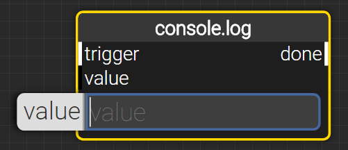
Shows the editor contents for the console.log node. The highlighted input field (blue ouline) is from the index.htm belonging to the node.
index.htm
The contents of your index.htm will be injected in the node directly, wrapped by a shadow DOM. For this reason, the index.htm does not need any base HTML structure, consisting of a doctype, html, head & body element. Instead, you can put the body contents directly in the index.htm.
As an example, here are the full contents of the index.htm for earlier mentioned "console.log" node;
<inputdata-hide-if-attached="input[name=value]"data-output-value="value"type="text"placeholder="value"required="required"/>
Implementation examples
Form elements
The main reason for having an index.htm is most likely to provide a way for end-users to provide configuration data on a node, which than can be consumed at runtime.
XIBLE works with certain standards to ensure;
- Standardized styling for nodes.
- Standardized help pages and node descriptions.
- Managing semantics for input fields.
- Manging data for nodes.
Requirements
To have XIBLE manage this, there are certain requirements to how an index.htm is formed;
-
Supported form elements (
INPUT,SELECT,TEXTAREA) must be stored in the root of the index.htm, not wrapped by any element.
One exception here is that thedata-output-valueattribute is honored no matter where the element exists in the DOM tree. -
The
data-output-valueattribute must be set to point at the nodes' data attribute. -
The
placeholderattribute must be set to provide a label for the input. If this is not provided, thedata-output-valuewill be used as a label instead. - Further optional attributes can be found in the special attributes section.
Standardized styling
For users to feel confident on using XIBLE no matter the nodepacks installed, it is important to provide a consistent look and feel. It is therefor advisable to simply use bare input and select elements as described on this page.
Managing semantics
Input fields are automatically wrapped in a LABEL element.
Input fields with the attribute "type" set to "password" will have a visibility toggle added.
Input fields with a data-output-value that targets a node' data attribute which is stored in the vault,
will render a shield icon to clarify this to the end-user.
Input fields which are not required are not rendered by default, unless the node is either selected, or the mouse is hovering over the node.
Managing data
XIBLE picks up the basic input elements in the root of a node's editor/index.htm,
and manages the state for you.
It will ensure that the data provided in an input element
is available using the node's getData() method.
For this, the data-output-value attribute must be set.
Implementation examples
Refering to other files.
Everything within the editor directory is available on the following http path: /api/nodes/node-name/editor/.
Images, stylesheets, client-side javascript, etc. stored there can be loaded like you would any resource in HTML.
Special attributes
There are several HTML attributes available which allow XIBLE to determine what to do with the data. These are mainly applicable to form elements.
data-description
Sets the description for the input element.
Example
The following example would add a description to an input element. These descriptions are visible when viewing the details of a node.
<inputdata-description="Some description about what this input element is all about.">
Applicable
- Form elements, including
LABEL
data-hide-if-attached
Hides the element when the given input or output has been connected/attached.
In the form of (input|output)[name=io-name].
Example
The following example would hide the input element when a connection is made with the "world"-output.
<inputdata-hide-if-attached="output[name=world]">
Applicable
- Any element
data-output-value
Assigns the value of the form element to the nodes' data object, upon saving the flow.
Example
In the earlier mentioned "console.log" example,
the value of the input field is available for the node using await NODE.getData('value', state).
<inputdata-output-value="value">
Applicable
- Form elements, including
LABEL
required
The editor hides input fields by default if the corresponding node is not focussed, selected or hovered. However, if the required flag is set on an input field, it will always be visible.
Example
In the earlier mentioned "console.log" example, the input field is always visible in the editor.
<inputrequired="required">
Applicable
- Form elements, including
LABEL
Styling elements
To have a consistent styling in the editor, it is important to follow some rules for the more basic elements.
This mostly concerns form elements: INPUT, SELECT and TEXTAREA.
Custom styles
Because the editor contents within the node are wrapped in a shadow DOM,
you can apply styling by adding a style element to your index.htm, or referring to a stylesheet using a link directive.
Please note that it is not advised to make changes to the default styling rules applicable for many form elements.
Labels
For your input elements, you do not need to create LABEL-elements, as they are automatically created for you.
If you still insist on creating them yourself, keep with the following style;
<label data-description="some description"><input /></label>
When creating your own LABEL elements, the previously mentioned special attributes should be applied to the label element.